Posts

Showing posts from March, 2012

Back to the typewriter again

Image
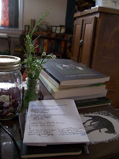
I've let myself wallow in quite a dry spell the past few months. I guess I just had so many other projects I wanted to work on in my very limited free time and I sent writing back to the end of the line over and over again. It's time to push through that. Spring is here and a new year of writing begins now. Submissions have opened again for The Fairy Tale Review . This one will be The Yellow Issue and is to be guest-edited by Lily Hoang ! If you haven't read any of her work, do it now. The Evolutionary Revolution (from Les Figues Press) knocked the wind out of me. She also has a book published by Fairy Tale Review Press called Changing , which is on my nightstand now. I'll probably crack that open after I've finished The Complete Tales of Lucy Gold , by Kate Bernheimer (the last in the Gold sisters' trilogy). As a very minor side note which is completely off the point,  the wildflowers (or, to some of you, weeds) in the picture above are called hairy bitte

The first time is a messy one

Image
Getting my first print job ready was definitely quite a bit of work. It should get easier after this one because this project was a BIG part of the getting-to-know-each-other process with my new printing press. And I discovered that there were quite a few things to be adjusted. Here's how we began: Setting the type: letter by letter, line by line on the composing stick. As the composing stick fills up, the set lines are removed from the stick on to a galley. Locking the form into the chase: when all the type has been set, the chase is laid on a flat surface (the floor, in my case) and the text and/or woodcuts/linocuts are arrange within its frame. Then the rest of the space is filled in with press furniture and the quoin locks it up tight. Securing the tympan sheet and adjusting packing: tympan paper, pressboard, and any other packing paper should be cut to the size of the platen (with the tympan sheet long enough to overlap at top and bottom, so it can be secured under th

Lessons in linoleum

Image
There are a couple ways you can print your own hand-drawn images on your letterpress. The more expensive way is by having photopolymer plates made from your image. I've tried that before and it works really, really well and is very efficient. But I wanted to give linoleum carving a go this time: it lessens the modern plastic intrusion into the printing process and adds to that imperfect, rough handmade goodness. The mounted linoleum blocks are pretty inexpensive and the carving tools (the best are made by Speedball), are as well. Letterpress printing does require mounted linoleum blocks to make the relief type-high. So here's how I went about it: Since my drawing skills are pretty poor, I practiced drawing the image I wanted to print. I also figured that, since I haven't had much practice with carving anything, the simpler the design, the better. More like a silhouette. Once I had the image, I drew out a final draft in pencil (it does have to be in pencil for the

Closing credits: type on the big screen

Image
Being a letterpress-dork, the thing that really caught my attention the first time I watched Guy Ritchie's Sherlock Holmes (which I love) was the title sequence. I said, "Wait a minute! That was letterpress type!" Isn't it gorgeous? Very clever of him. But this isn't even a new idea in the world of movie title sequences. While re-watching a favorite of mine from a previous decade (before my induction into the world of printing), I noticed the same thing. Although in Martin Scorcese's Gangs of New York , they used wood type instead of lead type. But the effect is perfectly striking and really helps capture the historical atmosphere of the movie. So what is it about the physical look of wood and lead type rather than the inked impressions they create? Maybe their very physicality is part of the draw. Both of these movies are set in the same historical time period, right around the American Civil War. Maybe it is a metaphorical link to the backstage o