Posts

Showing posts from June, 2012

Almost

Image
It doesn't take long for letterpress to rub off on you. The Cold Moon Press catalog commission is almost finished. The last of the paper has finally arrived (after some maneuvering on my end), so this week I will finish the printing. And then, as soon as the ink has safely dried, I will begin binding all these little guys.  I'm almost sad for this project to end. I have had a lot of fun with it, getting to try new techniques and getting more practiced with the ones with which I'm already quite a bit familiar. I'm always learning something new with letterpress and I love that.  I've even been enjoying the boring bits like finding and ordering materials and supplies: Hahnem ΓΌ hle Ingres antique paper from ArtPaper (and when they're out of stock, from FineArtStore ); the heavier stock white Stonehenge paper from ArtPaper; fun and gorgeous end papers from Paper Mojo ; Irish waxed linen thread in slate grey from ArtPaper (and when they're out of...
International Typewriter Day

Image
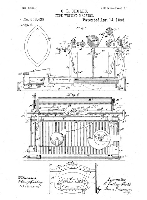
I recently learned that there is an International Typewriter Day . No joke! It is celebrated (by a select few people around the world) on June 23 of each year, commemorating the anniversary of the granting of the first "practical" typewriter patent to Christopher Latham Sholes in 1868. That makes this patent (and the typewriter) 144 years old. Further, the problems with key jams encountered with this first patented typewriter led Sholes to design the QWERTY keyboard. A good piece of trivia for you. Page from a later typewriter patent granted to Sholes, available online courtesy of Google. "A machine by which it is assumed that a man may print his thoughts twice as fast as he can write them..." ( from Scientific American , July 1867 ) Do any of you reading this out there have a typewriter of your own? I love my fifties-era Remington Rand. What make do you have? They are all so beautiful in their own ways, every incarnation of C. L. Sholes' "Type ...

In living watercolor

Image
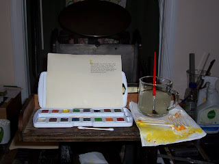
Captain's feed tray served as a platform for my supplies. On Sunday, I painted with toothpicks and cotton swabs. After a productive week of printing, I decided to try a little something that I haven't done before: apply watercolor to letterpress. After printing the Cold Moon Press tagline page, I noticed a little something that continued to bother me. I was really excited when I found a candlestick among my printing dingbats to use as a decorative initial "I." It looked great in among the set type, but when printed there was one feature of the candlestick dingbat that made it slightly... confusing when trying to read. That little fingerhold at the bottom right looks just like a letter "O," and I found myself reading " On the light of a winter's night..." That's a problem. Not a big one, but from a design perspective, that little confusion gets in the way of the overall idea/image you are trying to present: clarity is the objective. But...

Makeover; or making it up as I go along

Image
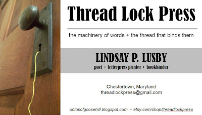
I have been doing some brainstorming lately regarding updating the Etsy shop and taking the Thread Lock Press endeavor a little more seriously. I've come up with a tagline: "the machinery of words + the thread that binds them." And here's a business card design that (I hope) captures the new aesthetic: It goes along with the new shop banner, anyway. I like it. And now I really want to do a little research into niche marketing and how I can be doing things better to get more profitable results. Honestly, TLP has only been an in-my-spare-time, just-for-fun sort of thing. But maybe it's time to make this into something more. Time for me and TLP to do some growing up.