Posts

It's my party

Image
On the occasion of my birthday (and William Shakespeare's), a list of small luxuries I would love to add to my wardrobe: 1. Large black pashmina scarf with screenprinted copper typewriter from Cyberoptix .  2. Vintage Stanley ruler bangle from JacQ .  3. Real Women Make an Impression tote from a. favorite design .  4. "Pushing the Envelope" merit badge from Lee Meszaros . 

Practice practice practice

Image
A few weeks ago a friend of mine commissioned me for a small edition of a letterpress broadside featuring the text of "Bond and Free" by Robert Frost. This was a great opportunity to get some experience on the business end of printing as well as getting some more practice with my press. I ordered some beautiful paper from ArtPaper : 100% cotton, mouldmade in France, with beautiful deckled edges. I even invested in another color of ink: Pantone Reflex Blue. It's always fun to play around with quality materials.

In a name

Image
When I came up with the name Thread Lock Press, I must admit that I did not have all of these connotations in mind. I liked the sound of it for what it was I was doing. It began with a brief fairy-tale-based chapbook of three poems with accompanying watercolor paintings by my friend Emily. But now that I've had time to live inside it for a while and grow, I find that it is even more well-suited to what I'm becoming in my work. In the past couple years, my interests in writing poetry, letterpress printing, and experiments in sewing by hand have all been tugging at me for fuller attention. Poetry and the writing of it will always be my primary concern, and what time is left is divided between the latter two. But gathered under this name, I see how they can all fit together. The making of books, from start to finish, involves equal parts printing, and sewing. There is the writing/creating of the text; the designing, setting, and printing of the text; and then the binding of th...

Hello, again, NPM

Image
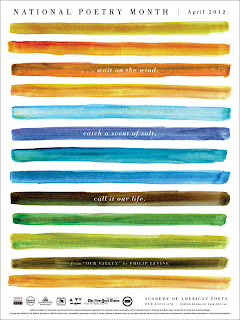
Official NPM 2012 poster I cannot believe it has already been a year since the last National Poetry Month, but here we are again. My hope is that I will force myself to make enough time for writing this month. I would say I will write a poem every day this month to celebrate, but I know that is far too ambitious a project for me. I hope only to finish the one I am working on right now (which is a slow one) to my satisfaction, and maybe start one or two more. But in the spirit of the month and the season, I would like to offer up a reading recommendation. One of my favorite poems is "Deep Pond at Dusk in Heavy Rain Against Pines" by J. Allyn Rosser. It first appeared in the October 1992 issue of Poetry magazine and then was gathered for her book Misery Prefigured .  The green of that poem. Some days I wish I could live inside it.

Back to the typewriter again

Image
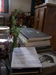
I've let myself wallow in quite a dry spell the past few months. I guess I just had so many other projects I wanted to work on in my very limited free time and I sent writing back to the end of the line over and over again. It's time to push through that. Spring is here and a new year of writing begins now. Submissions have opened again for The Fairy Tale Review . This one will be The Yellow Issue and is to be guest-edited by Lily Hoang ! If you haven't read any of her work, do it now. The Evolutionary Revolution (from Les Figues Press) knocked the wind out of me. She also has a book published by Fairy Tale Review Press called Changing , which is on my nightstand now. I'll probably crack that open after I've finished The Complete Tales of Lucy Gold , by Kate Bernheimer (the last in the Gold sisters' trilogy). As a very minor side note which is completely off the point,  the wildflowers (or, to some of you, weeds) in the picture above are called hairy bitte...

The first time is a messy one

Image
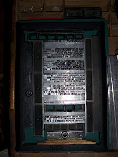
Getting my first print job ready was definitely quite a bit of work. It should get easier after this one because this project was a BIG part of the getting-to-know-each-other process with my new printing press. And I discovered that there were quite a few things to be adjusted. Here's how we began: Setting the type: letter by letter, line by line on the composing stick. As the composing stick fills up, the set lines are removed from the stick on to a galley. Locking the form into the chase: when all the type has been set, the chase is laid on a flat surface (the floor, in my case) and the text and/or woodcuts/linocuts are arrange within its frame. Then the rest of the space is filled in with press furniture and the quoin locks it up tight. Securing the tympan sheet and adjusting packing: tympan paper, pressboard, and any other packing paper should be cut to the size of the platen (with the tympan sheet long enough to overlap at top and bottom, so it can be secured under th...

Lessons in linoleum

Image
There are a couple ways you can print your own hand-drawn images on your letterpress. The more expensive way is by having photopolymer plates made from your image. I've tried that before and it works really, really well and is very efficient. But I wanted to give linoleum carving a go this time: it lessens the modern plastic intrusion into the printing process and adds to that imperfect, rough handmade goodness. The mounted linoleum blocks are pretty inexpensive and the carving tools (the best are made by Speedball), are as well. Letterpress printing does require mounted linoleum blocks to make the relief type-high. So here's how I went about it: Since my drawing skills are pretty poor, I practiced drawing the image I wanted to print. I also figured that, since I haven't had much practice with carving anything, the simpler the design, the better. More like a silhouette. Once I had the image, I drew out a final draft in pencil (it does have to be in pencil for the ...